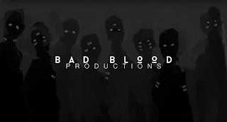
These two logos are the production companies of the people who made the short film for their media class; titled ‘Young Blood Media Studies AS 2013-14’.
 This was made in a very simple manor, but does not look like it
does. It is like an illusion. It seems like a flame and water merging, when in
fact it is just a disc having water poured on it. This simplistic idea is
impressive, and makes the finished product look marvellous even after knowing
what it actually is. I believe that the logo is successful because it is such a
simplistic design that it is impressive how it gives off the illusion of being
something that it is not. It does not change much, as it is just a disc with water
being poured, and the light reflected off of the disc makes the flame look.
This logo is fitting for a horror film, as there are elements of
horror with the silhouettes of children with many eyes. This was made with photoshop, and is a good idea to do, as you can take any picture and using the
tools you could turn it into anything. It is impressive, as they have taken
different shades of grey and used it to create the shadow figures that are
behind the logo ‘Bad Blood Productions’. They also move, as if they are shadows
and light is being shined on them. It seems hard and a long process to make
something like this, which is impressive that they achieved it and made it look
superb.

No comments:
Post a Comment